 "not for canada - australian in disguise" (for-canada)
09/21/2019 at 01:39 Ľ Filed to: None
 0
0
 2
2
 "not for canada - australian in disguise" (for-canada)
09/21/2019 at 01:39 Ľ Filed to: None |  0 0
|  2 2 |
Disclaimer: I donĺt watch F1 on a regular basis, mostly because I donĺt have cable, and also mostly because Iĺm a filthy North American and the only races that are at a practical time are the USGP and Canadian GP.
That being said;
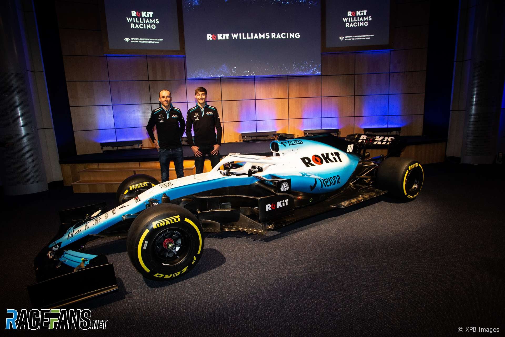
10. Williams. They seriously went from their fantastic Martini livery to this bland garbage. Itĺs really not that bad on itĺs own, but the fact that it replaced the Martini livery is a crime against humanity and my eyes.
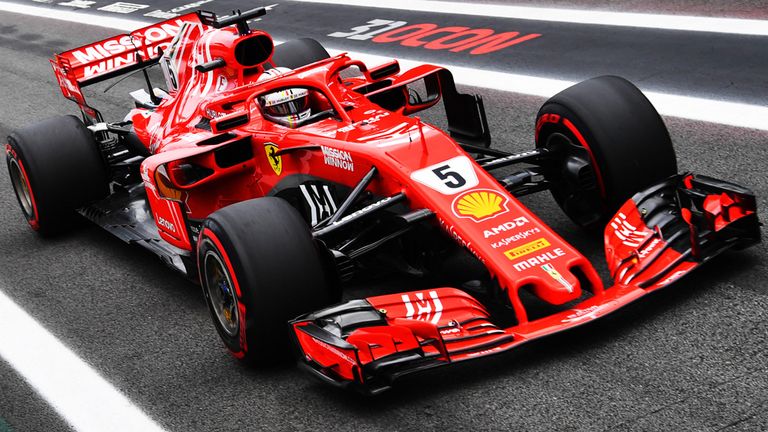
9. Ferrari. I know this will be an unpopular opinion, but Ferrari has bland liveries. Just red and some logos. I do like how theyĺve started to include black accents, which do bump them up a few spots, but itĺs still not enough in my opinion.
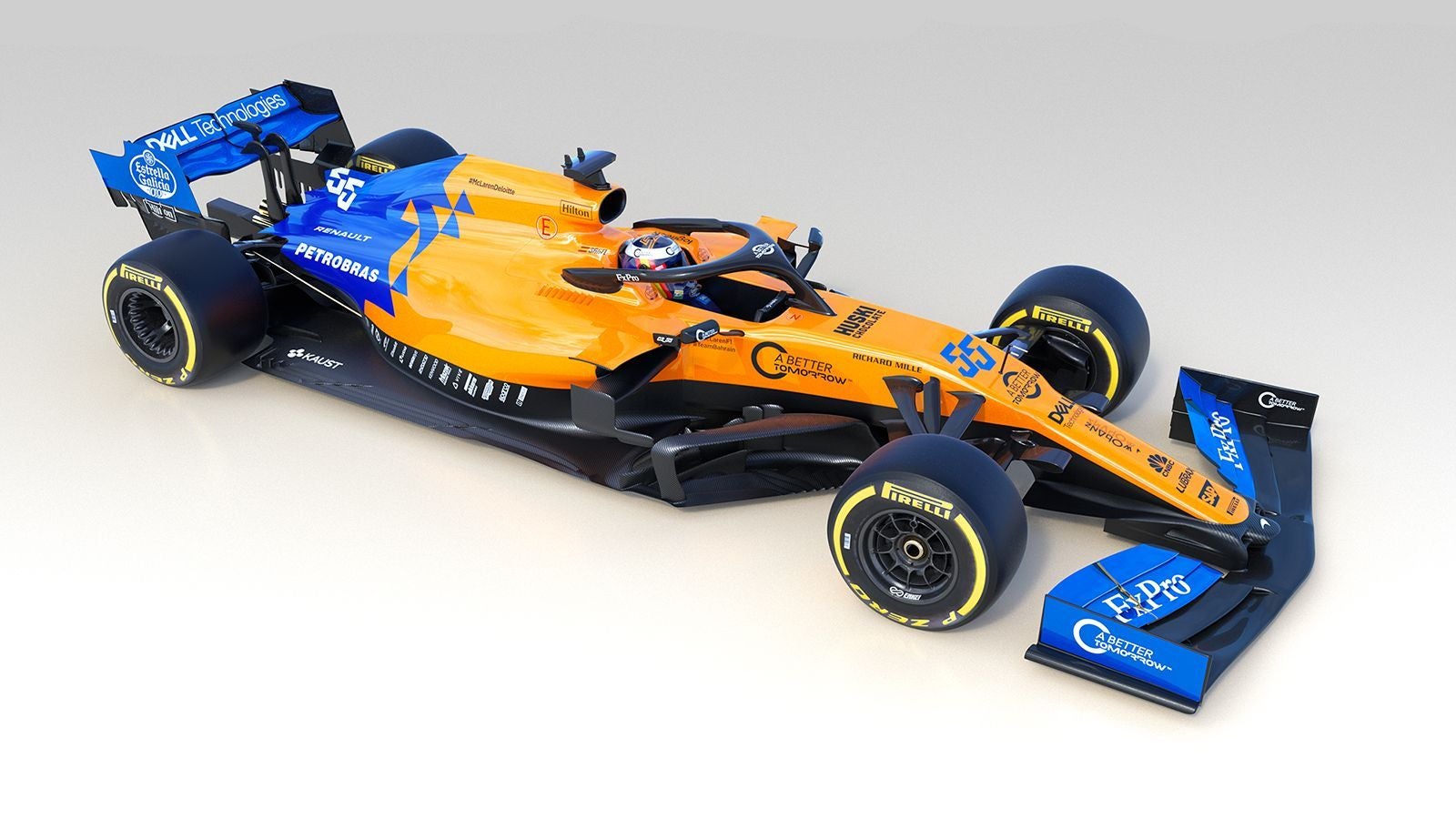
8. McLaren. Not great, not terrible. The diamonds are cool, and the paint scheme is a pretty nice (albeit maybe unintentional) throwback to the old Renaults of the mid-2000s. Itĺs definitely not the most exciting livery McLarenĺs had. Bri
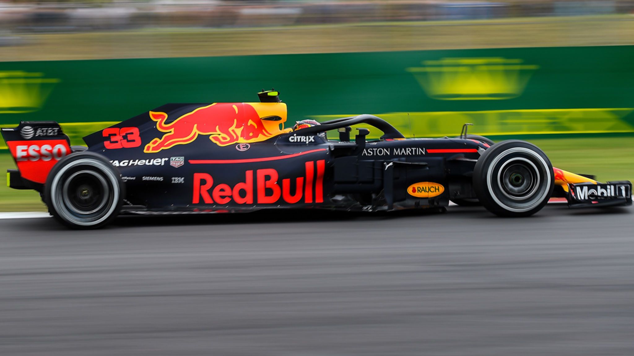
7. Red Bull. Itĺs definitely a Red Bull livery. This time the blueĺs darker. Wow.
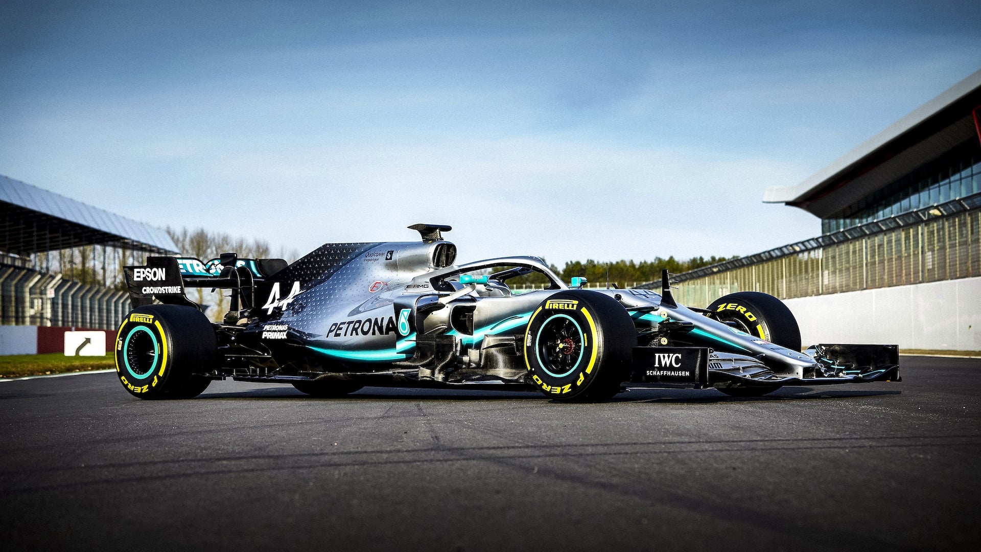
6. Mercedes. Pretty attractive, not really special, but itĺs alright. You can tell I really care about the subject matter at hand.
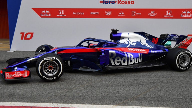
5. Toro Rosso. Red Bullĺs farm team has a way better paint scheme than Red Bull themselves, mostly because itĺs actually different to every other Red Bull motorsports livery for the past 25 years.

4. Renault. This is a good paint scheme. Itĺs simple, but the colours work well together and the sponsors arenĺt completely overbearing.
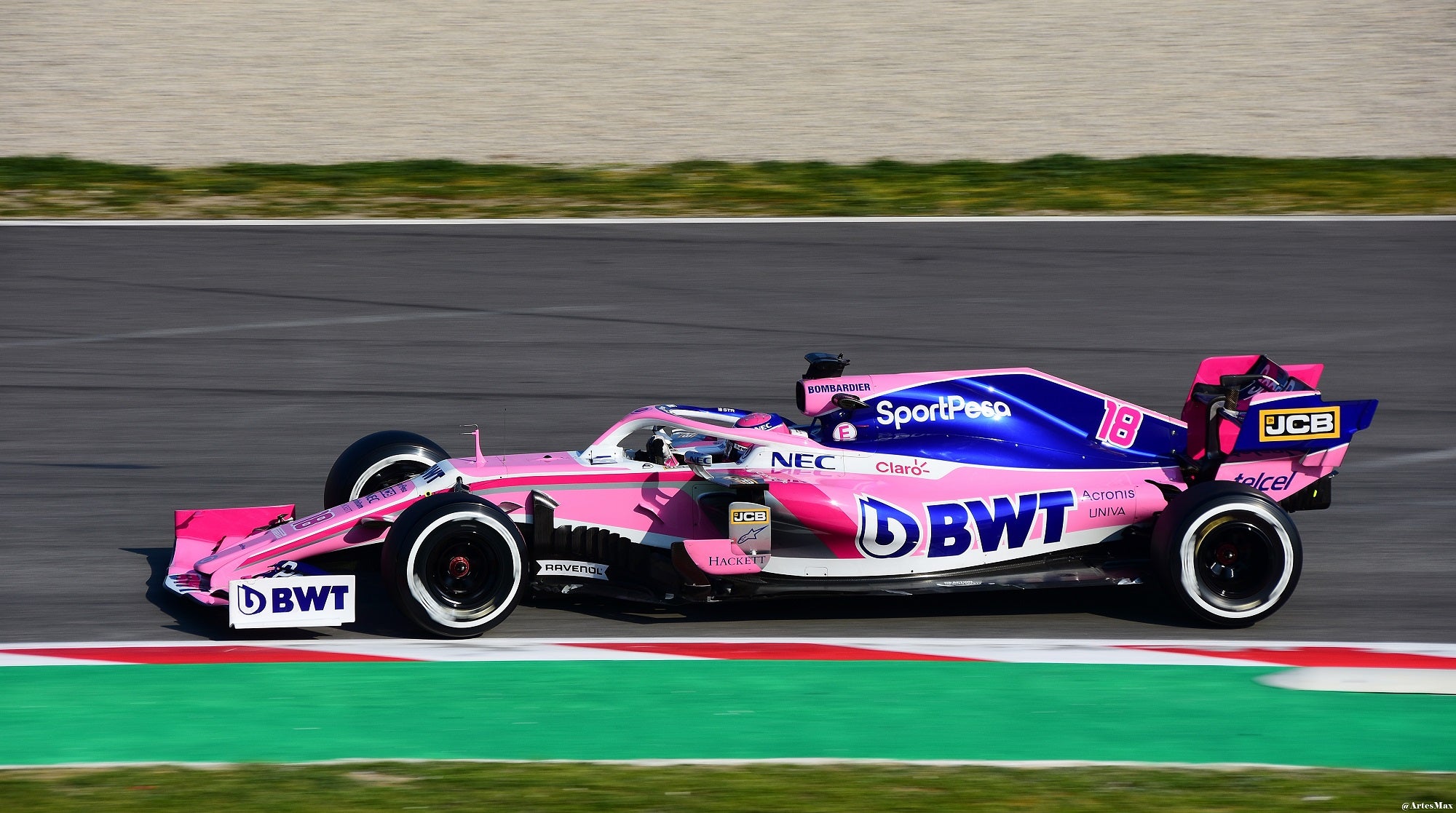
3. Racing Point. This may be another unpopular opinion, but this is a good livery. Pink is a colour rarely used in motorsports, and it works well here.
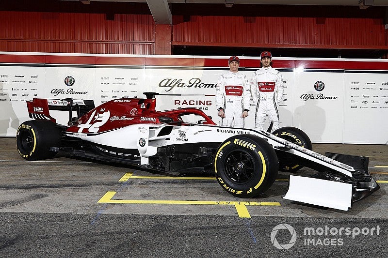
2. Alfa. Once again, the farm team (this time Ferrariĺs) has a way better paint scheme than the parent team. The simplified Alfa badge on the side is fantastic looking, and the Quadrifoglio badge is a lovely touch.
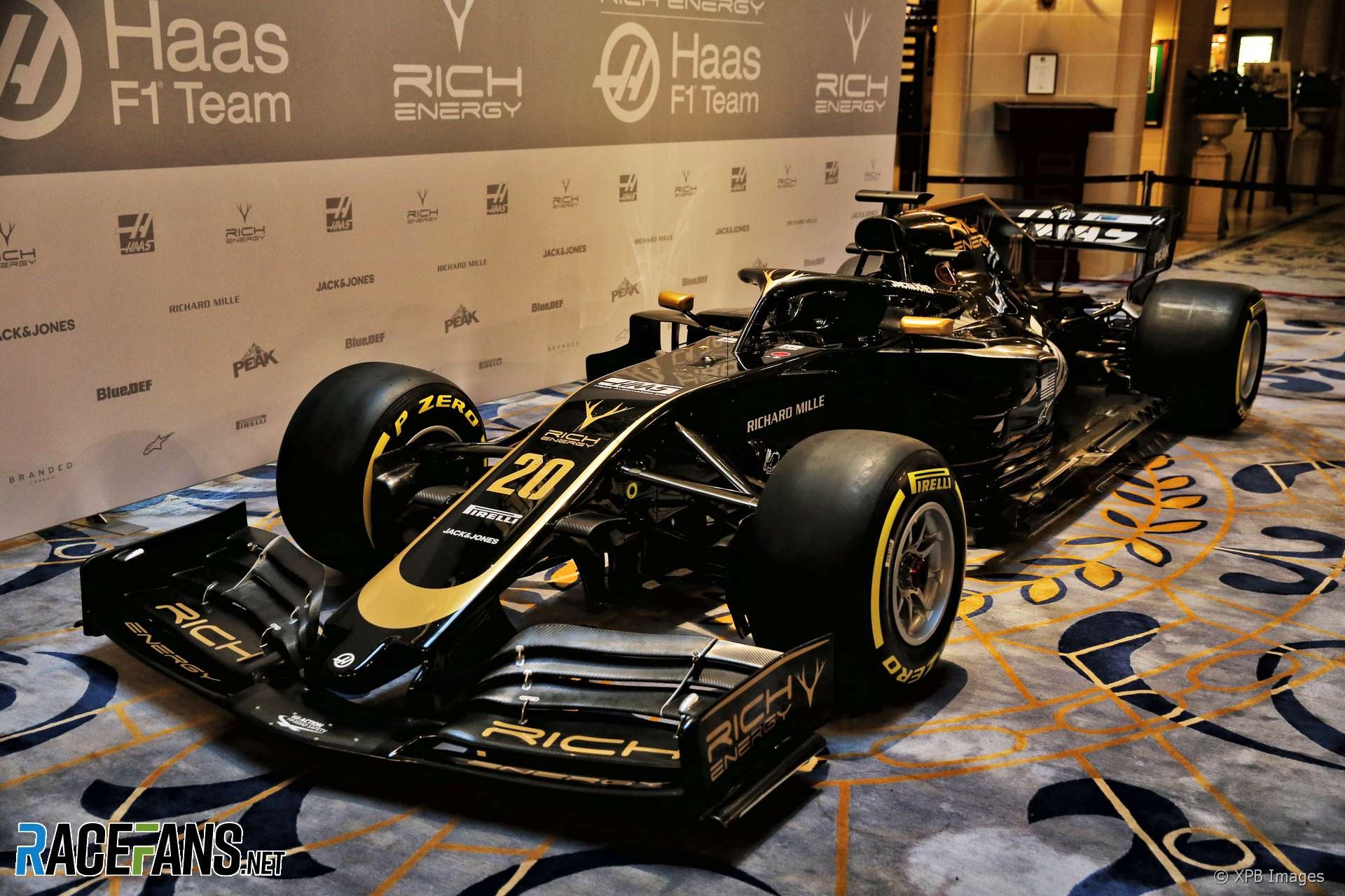
1. Haas. This is the best livery in the series currently, and one of the best in a very long time. Itĺs very obviously a ôhomageö (if you will) to the John Player Special Lotuses of yore, but if it ainĺt broke, donĺt fix it ( Williams ). Itĺs just a shame weĺll most likely lose it next season since Rich Energy is out. Hopefully they replace it with something as pretty.
 ADabOfOppo; Gone Plaid (Instructables Can Be Confusable)
> not for canada - australian in disguise
09/21/2019 at 07:34 |
|
They should just call it Formula Ugly. I like none of those liveries and hadnĺt really noticed until now how hideous and ungainly all the current FU cars are. Those cars are all far too large.á
 glemon
> ADabOfOppo; Gone Plaid (Instructables Can Be Confusable)
09/21/2019 at 11:49 |
|
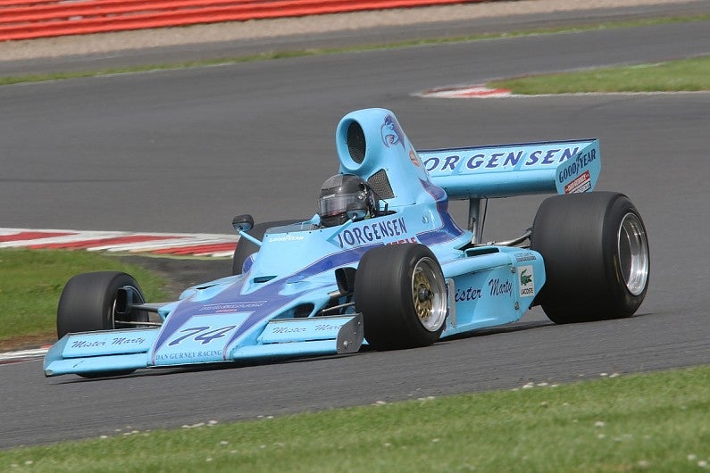
They look big or out of proportion because the tires are too small